


 Ban & Monetization Policy
 MyLiveRoom Rewards Program Rules & Eligibility
How to Pick a Whole-House Colour Palette That Won’t Look Dated in 5 Years
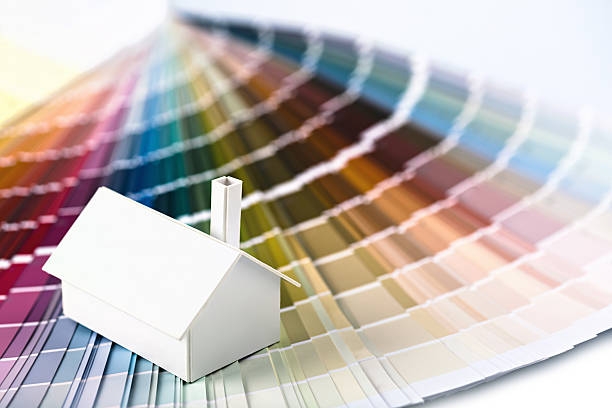
Every era of interior design leaves behind its casualties. The sponge painted terracotta of the late nineties, the chocolate brown accent walls of the mid two thousands, the wall to wall cool grey of the twenty tens: each looked utterly current in its moment and utterly time stamped five years later. The homeowners who repainted those walls did not choose badly by the standards of their day; they chose trend first and structure second, and trend first palettes have a predictable shelf life. The good news is that timeless palettes are not a matter of taste or luck. They follow a small set of structural rules that colour consultants use on every whole home project, and once you understand the rules, you can build a palette that still looks considered a decade from now, regardless of where trends wander.
The core insight is that palettes date for identifiable reasons: they lean on one fashionable colour everywhere, they ignore the fixed elements of the house, or they lack the tonal structure that lets rooms relate to each other. A palette built the opposite way, anchored to the home’s permanent materials, organized around undertones rather than colours, and varied in depth rather than in hue, simply has nothing in it to expire.
Start With What You Cannot Repaint
Before looking at a single paint chip, inventory the fixed elements of your home: flooring, countertops, tile, brick or stone, cabinetry you intend to keep, and the large furniture that is staying. Every one of these has an undertone, warm or cool, and collectively they vote on what your walls can be. The single most common reason a freshly painted house feels subtly wrong is an undertone clash: cool grey walls fighting warm oak floors, or a pink beige carpet arguing with a green beige wall. Trends come and go, but an undertone clash looks off in every era. Pull the undertones out of your fixed elements first, decide whether your house is fundamentally warm, cool, or genuinely neutral, and let that decision constrain everything downstream. A palette that agrees with the bones of the house ages gracefully because it looks like it belongs there, and belonging does not go out of style.
Build on a Three Level Structure
Professional whole home palettes almost always resolve into three tiers. The first is the connective neutral: one wall colour, usually a soft warm white or a quiet greige matched to your undertone family, that runs through halls, stairways, and open sightlines and gives the house a continuous spine. The second tier is two or three supporting colours, deeper or moodier relatives of the neutral, used in rooms that can carry more character, such as dining rooms, offices, and bedrooms. The third tier is accent colour, which lives in the smallest and most easily changed places: a powder room, an interior door, the back of a bookcase. The structure is what future proofs the scheme. When tastes shift, you refresh the accent tier in a weekend and the house feels current again, while the connective spine, the expensive part to repaint, was never trendy enough to date. Homeowners who paint every room a different fashionable colour invert this pyramid and end up repainting the whole house when the fashion turns.
Choose Complexity Over Fashion
There is a reliable difference between colours that survive and colours that expire: the survivors are complex and slightly muted, while the casualties are pure and loud. A complex colour contains a whisper of its opposite, like a green softened with grey, a blue warmed with a drop of red, a white with enough pigment to have a personality. These colours shift gently through the day, read differently in morning and evening light, and give the eye something to keep discovering, which is why heritage paint ranges are built almost entirely from them. Pure, saturated trend colours announce their decade because they photograph well, and social media has accelerated their turnover from decades to a few years. Major manufacturers such as Benjamin Moore maintain historical and classic collections precisely because these muted, complex formulas outsell trends over the long run (benjaminmoore.com). When you fall in love with a fashionable colour, the durable move is to find its complex, slightly greyed cousin and use the pure version in textiles you can change.
Test Like the Professionals Do
Even a structurally perfect palette can fail in execution if it is chosen from chips under store lighting. Buy sample pots of your finalists, paint half metre squares on at least two walls per room, and live with them through several days of changing light, including lamplight in the evening. Check the sightlines especially: stand where you can see three rooms at once and confirm the colours converse rather than compete, because open plan homes are experienced as sequences, not as isolated rooms. This is the stage where an experienced eye pays for itself fastest, and a professional colour consultation typically resolves in two hours what homeowners otherwise negotiate through weeks of second guessing and the occasional repainted room. A palette chosen this way is not a snapshot of this year’s taste; it is a framework the house can wear for a decade, flexing at the edges while the core stays right.
Frequently Asked Questions
How many paint colours should a whole house palette contain?
Most successful schemes use four to six: one connective neutral for shared spaces, two or three supporting colours for individual rooms, and one or two accents for small dramatic moments. Fewer than that risks monotony in a larger home, while more than seven or eight usually fragments the house into disconnected rooms.
Should every room be a different colour or the same colour?
Neither extreme serves most homes. The durable pattern is a continuous neutral through halls and open sightlines, with individual rooms stepping darker, lighter, or richer within the same undertone family. That gives each room identity while the house still reads as one composition.
How do I identify the undertone of my floors and fixed finishes?
Compare them against something truly neutral, like a plain white card, in daylight. Wood, stone, and tile will reveal a lean toward yellow, orange, pink, or green. Group your fixed elements by that lean, and choose wall colours whose undertones agree with the majority rather than fighting it.
Are grey walls dated now?
The flat, cool, blue leaning greys that dominated the twenty tens now read as period specific, but grey as a category is not dead. Warmer complex greys and greige tones, chosen to match a home’s undertones, remain quietly current precisely because they never depended on the trend to make sense.
 Turkish
 English
 Arabic
 French
 Spanish
 Portuguese
 Deutsch
 Dutch
Dutch
 Italiano
 Russian
 Romaian
 Portuguese (Brazil)
 Greek
Greek